Cooler colors or neutrals on a cool backdrop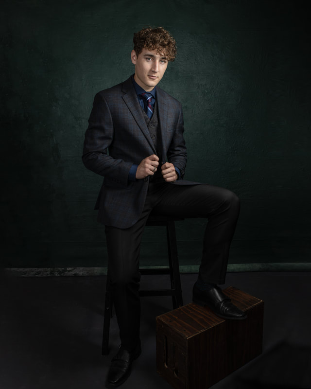 In the above image we can see the result of cool and/or neutral colors against a cool colored backdrop. This tends to deemphasize the clothing and helps the skin tones pop against the backdrop. This look is very stylish and painterly when done right, and the backdrop can also be a neutral grey with a similar result. It puts the focus on the face and skin tones. This is one of my favorite looks for portraits. Click Read More to continue reading. Neutral colors on a warm backdrop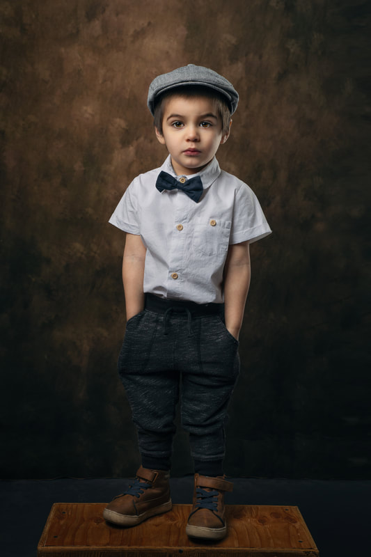 This can be more difficult to pull off but when it works it can provide a great nostalgic feeling to the portrait. The warm tones tend to blend with the skin so the lighting has to be just right. When everything comes together the result is a very "Old Masters" or Renaissance portrait feel, bringing to mind some of the palettes of Rembrandt or Caravaggio. What the heck are cool or warm colors?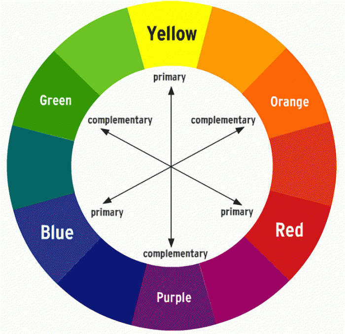 The colors on the right hand side of the color wheel are considered warm, the ones on the left considered cool. So yellow, orange, red are our warm colors, and all skin tones are found in this grouping. Greens and blues are considered cool. This is why a bluish backdrop can make skin tones really pop, because blues and oranges are opposite on the color wheel. For darker skin tones, green can work really well, especially when paired with neutral clothing or green clothing on a neutral backdrop. Will I have to remember all this? |
AuthorDarian Rundall, Fine Art Photographer Archives
March 2022
Categories |
 RSS Feed
